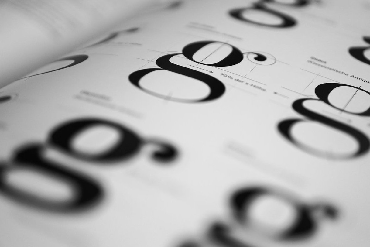
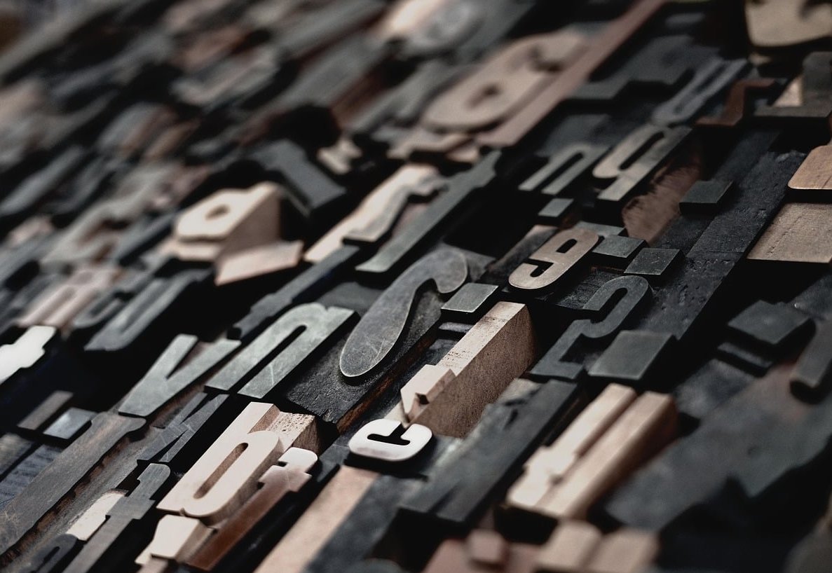
Mixing typefaces is one of those design moves that looks effortless when done right and painfully amateur when done wrong. If you’ve ever stared at a Figma file wondering whether your headline serif is fighting your body sans, you’re not alone. The good news: there are clear principles behind every great pairing, and once you understand them, you can pair serif and sans serif fonts with confidence on any project.
This guide skips the generic “top 50 fonts” listicles. Instead, we walk through seven combinations that actually work in production, explain why they work, and show you exactly where to use them.
Why Pair Serif and Sans Serif Fonts in the First Place?
Serifs carry history, warmth, and a sense of authority. Sans serifs feel clean, modern, and efficient. When you put them next to each other, you create contrast, which is the engine of visual hierarchy. A page using a single typeface across all weights can feel flat. A page that mixes a serif headline with a sans body suddenly has rhythm.
Three principles drive every successful pairing:
- Contrast: the two fonts should look meaningfully different (not just slightly different)
- Hierarchy: one font leads, the other supports. Never let them compete
- Mood matching: both fonts should feel like they belong to the same brand universe, even if they look different
The 3 Rules Before You Pick Anything
- Pick a workhorse first. Choose your body font before your headline font. The body does 90% of the reading work.
- Avoid same-mood clones. Two geometric fonts side by side cancel each other out. You need tension.
- Test at real sizes. A pairing that looks gorgeous at 72px on Dribbble can collapse at 16px in production.
7 Serif and Sans Serif Combinations That Actually Work
1. Playfair Display + Inter
Best for: editorial websites, online magazines, long-form blogs.
Playfair Display is a high-contrast transitional serif with dramatic thick-and-thin strokes. Inter is a neutral, screen-optimized sans designed by Rasmus Andersson. The drama of Playfair lets your headlines breathe like magazine covers, while Inter handles dense paragraphs without fatigue.
Use Playfair for H1 and H2. Use Inter for body, captions, and UI elements.
2. Fraunces + Inter
Best for: SaaS landing pages with personality, indie product brands.
Fraunces is a variable serif with optical sizing and a slightly quirky, almost wonky character. Pairing it with Inter gives you a warm, human headline against a clinically clean body. This is the combo behind a lot of modern “friendly tech” startups in 2026.
3. IBM Plex Serif + IBM Plex Sans
Best for: technical documentation, developer tools, B2B SaaS.
This is the safest bet on the list because both fonts come from the same superfamily. They share metrics, x-heights, and proportions, which means they pair effortlessly. The serif version brings just enough warmth to soften the engineering vibe.
4. Lora + Work Sans
Best for: personal branding, portfolios, freelance creatives.
Lora is a contemporary serif with calligraphic roots. Work Sans is a grotesque sans with friendly proportions. Together they read as approachable but professional, which is exactly what most personal sites need.
5. DM Serif Display + DM Sans
Best for: e-commerce, lifestyle brands, premium product pages.
DM Serif Display has a luxurious feel with high contrast strokes, while DM Sans stays geometric and grounded. The pairing works because they share a designer family, so the visual DNA is consistent even when the styles diverge sharply.
6. Merriweather + Source Sans 3
Best for: news sites, content-heavy blogs, knowledge bases.
Merriweather was literally designed for screen reading at small sizes. Pairing it with Source Sans 3 (the updated 2026 version of the classic Adobe sans) gives you maximum readability for long articles. This is the reading combo, full stop.
7. Instrument Serif + Geist
Best for: AI startups, modern landing pages, design-forward portfolios.
Instrument Serif feels classical and oversized in the best way. Geist, Vercel’s monospace-friendly sans, brings a contemporary tech edge. This is the pairing you’ll see across cutting-edge product sites this year.

Quick Reference Table
| Combination | Mood | Best Use Case |
|---|---|---|
| Playfair Display + Inter | Elegant, editorial | Magazines, blogs |
| Fraunces + Inter | Warm, quirky | SaaS landings |
| IBM Plex Serif + Sans | Technical, trustworthy | Docs, B2B |
| Lora + Work Sans | Friendly, personal | Portfolios |
| DM Serif Display + DM Sans | Premium, refined | E-commerce |
| Merriweather + Source Sans 3 | Readable, classic | News, knowledge bases |
| Instrument Serif + Geist | Bold, contemporary | AI, tech startups |
Common Mistakes When Pairing Serif and Sans Serif
- Picking two fonts with similar x-heights but opposite personalities: this creates uncomfortable tension
- Using a display serif for body text: display fonts collapse below 18px
- Forgetting fallback stacks: always define a system fallback for performance
- Mixing more than two families: a third font (especially a script) usually breaks hierarchy unless used for a single specific purpose
How to Test Your Pairing Before Shipping
- Set a real article (300+ words) using both fonts at production sizes
- View it on mobile, tablet, and desktop
- Check it in dark mode
- Print a screenshot in grayscale to see if hierarchy still holds
- Show it to someone who isn’t a designer and ask what feeling it gives them
FAQ
Should the headline always be the serif?
No. The classic move is sans body + serif headline, but reversing it (serif body + sans headline) works beautifully for long-form reading sites where the body needs warmth and the headline needs to feel like a label.
Can I pair two serifs or two sans serifs instead?
Yes, but it’s harder. You need strong contrast in weight, width, or style. Mixing serif with sans is the easier road because the contrast is built in.
Are Google Fonts good enough for professional projects?
Absolutely. Most pairings in this article are free on Google Fonts and used by major brands. The font you choose matters less than how you use it.
How many font weights do I need?
For most projects, four total weights across both families is plenty: regular and bold for the body sans, regular and bold for the serif headline. More than that and you’re probably overcomplicating things.
What about variable fonts?
If both your serif and sans are available as variable fonts (like Fraunces and Inter), use them. You get full weight and optical size flexibility from a single file, which is a huge performance win in 2026.
Mixing typefaces well is less about memorizing famous combinations and more about understanding contrast, hierarchy, and mood. Start with one of the seven pairings above, test it in your actual product, and trust your eye. That’s how every good designer does it.